 Statistical analysis in Excel is a huge pain unless you know how to enable the Analysis Toolpak. In part 1 of this series on data analysis in Excel, I’m going to tell you how to do that. Next, we’ll talk about regression analysis (the real thing, including multiple variables, not just fitting a line to a graph). This whole post should take 20 to 40 minutes.
(If you’re looking for info on statistical tests for Excel, click here to check out Part 2.)
How to Get Data Analysis in Excel 2010 or 2013
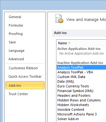
To do any real data analysis in Excel you’ll want to activate the Analysis ToolPak. The process for Excel 2010 and 2013 is essentially the same (although all screen shots come from Excel 2010). Click File in the top left corner, then go to Options.

In the pop-up, click Add-Ins in the left sidebar, then highlight “Analysis ToolPak” in the menu next to it.
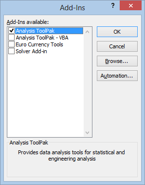
Now hit Go at the bottom of the window (not the OK button), and a box will pop up. Check the Analysis ToolPak option, then hit OK.
To get to the Analysis ToolPak, click the Data tab. At the far right end of the banner, you’ll see a new Analysis section, where you can click on Data Analysis.

So, how best to use the tool now that you have it? That all depends on the data and your goals with it, but since most people think of fitting a line to a bunch of points when they think of data analysis, we’ll start with this one:
Doing Regression Analysis in Excel
Let’s say we had some data that looked like this:

If we wanted to find an equation that could predict an estimate of Y based on X, we would need to do some regression analysis. So, the first thing we would do is click Data Analysis as we talked about above. That will take us to a menu where we’ll select Regression and then push OK.
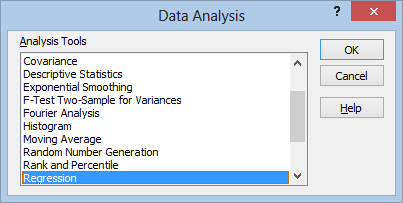
That will take us to this menu:
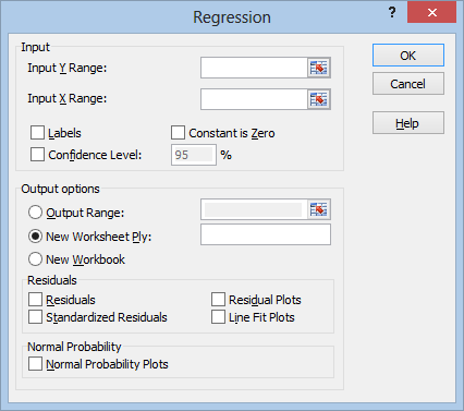
The “Y Range” is your dependent variable, the one you want to make predictions about. The “X Range” is the independent variable, the one you will be using to make the predictions. You can fill these by clicking in the range boxes, then dragging your mouse over the range, like this:
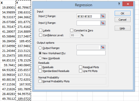
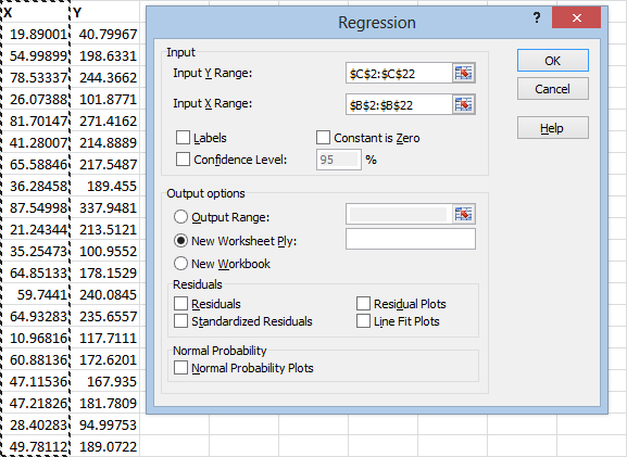
Notice that I’m including the column labels X and Y in the range that I select. This is because I’m going to click the “Labels” check box, which will use these labels when it gives me the results, instead of using an automatically generated label that could be confusing.
Unless you’re sure that the Y-value should be zero when the X-value is zero, you should leave the “Constant is Zero” check box alone.
The confidence level will be used to evaluate the parameters of our equation. It will give us lower and upper bounds. The default confidence is 95 percent, and this is what statisticians will typically use. Unless you have a reason to change it, leave it alone. The other most common settings are 99 percent and 90 percent.
(A confidence level of 95 percent means that, 95 percent of the time, the upper and lower bounds we calculate will contain the true parameter we are trying to estimate.)
At this point, you could hit the OK button, and the results would show up on a new sheet. If you want the results to show up on the same sheet, though, you’ll need to click the “Output Range” circle, click the range box next to it, and click the cell where you want the results to show up.
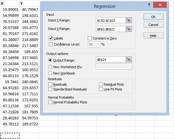
If you want to be especially thorough, you can also check the “Residuals” and “Standardized Residuals” boxes. The residual tells you how far the observed Y-value is from the predicted Y-value.
The standardized residual tells you how far the observed Y-value is from the predicted Y-value in standard deviations.
If you check “Residual Plots,” you’ll get a graph of the residuals. It’s a good idea to do this to see if there’s any kind of pattern in the residuals. If so, it means that the relationship between X and Y probably isn’t linear.
If you check “Line Fit Plots,” you’ll get a graph of the predicted Y-values superimposed on top of the actual Y-values.
If you check “Normal Probability Plots,” Excel will plot the Y-values (not the residuals, for some reason) against the sample percentiles. This one’s not particularly useful, and it’s not what is typically called a normal probability plot.
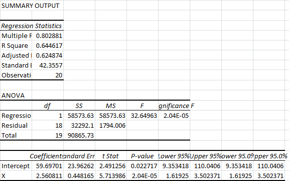
After you hit OK, your graphs and data will appear. One of the first things you’ll probably notice is that the cells aren’t formatted to fit the data very well:
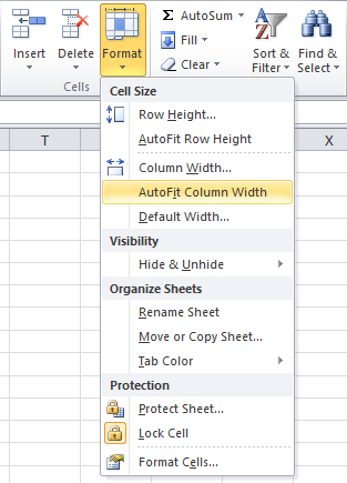
This is a relatively easy fix. Just select the columns you want to fit to the data, click the Home tab, then head over to the Cells section, click Format, and hit AutoFit Column Width:
Now lets take another look at the output data:
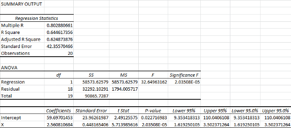
You’ll notice that it lists the 95% upper and lower bounds twice. If we had chosen a different confidence interval earlier, this is where it would have displayed. We can go ahead and delete these:
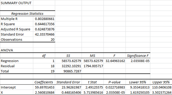
The Multiple R is your correlation coefficient. The closer this is to one, the stronger the linear relationship between your independent variable and your dependent variable.
The R Square is a ratio of the sum of squares explained by the model to the total sum of squares. It’s usually thought of as a ratio of “explained variance.” It’s also the correlation coefficient squared, hence the name.
The Adjusted R Square is similar to the R Square, except it takes into account the number of variables. If you’re comparing models with multiple variables, this is the statistic that you want to maximize.
The Standard Error listed below the Adjusted R Square is actually just the sample standard deviation for the y-values, ignoring any influence from the x-values. It is not a standard error for the mean.
In the ANOVA table, df represents degrees of freedom, SS represents sum of squares, MS represents mean square error, F represents the F-statistic for the F-test, and Significance F tells us the p-value for the F-test.
The only thing you’ll typically want to pay attention to in the ANOVA is the Significance F of the test. Excel performs an F-test for explained variance. In other words, it tests whether the variance explained by the model is significantly different from zero. In general, if your Significance F (p-value) is less than 0.05, the model is considered statistically significant. (A p-value of 0.05 means that, if we assume the model doesn’t explain anything, 5% of the time the test will falsely conclude that it does.)
I’ve gone into depth on p-values here.
Below the ANOVA is the analysis of our equation. The Coefficients column lists the estimates of the parameters for our prediction equation. In this case, our estimated prediction equation would be:
y = 59.7 + 2.56x
In this case, the Standard Error column tells us the average distance of our estimated coefficient from the actual population coefficient.
The P-value here is based on a t-test for the coefficient. In this case, we are testing whether the coefficient is significantly different from zero. You can see that the p-value for the coefficient of x is on the order of 1 in 100,000. This means that only about 1 in 100,000 tests like this would turn up a value at least this extreme if the true coefficient for x was zero.
(When there is only one predictive variable, this p-value is the same as the significance F. Don’t get used to this. It’s not the same when you have multiple predictive variables.)
Finally, the Lower 95% and Upper 95% tell us the upper and lower bounds for our coefficients, assuming 95 percent confidence. This means our acceptable range of predictive equations would be:
y = 9.35 + 1.62x
and
y = 110 + 3.50x
You could use these equations to set upper and lower bounds for any x-value, as long as you stay within the range of the sample. (You shouldn’t use regression to extrapolate outside of your sample data unless you have a good reason to expect things will stay linear.)
Now let’s take a look at the the graphs, starting with the residual plot:
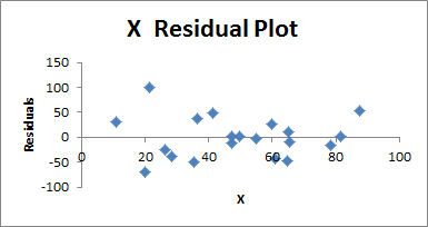
This is basically a plot of your sample data, where 0 represents the predicted y-value for each x-value. What you want to look for here is any evidence of curvature, or evidence that the points are getting more or less spread out as x gets larger.
If you see curvature, you will need to introduce an x2 variable, and perhaps higher order variables.
If you see a change in the variance of the residuals, where they are getting more or less spread out as x gets larger, you will need to replace y. What you replace it with depends on the kind of process you are measuring.
- If it’s a Poisson process, for example, you will need to replace y with √(y).
- If y represents a binomial proportion (a percentage), you need to replace it with sin-1√(y)
- If you are dealing with a multiplicative model, replace y with ln(y)
There is no easy way to conduct a normality test on the residuals in Excel, unfortunately. You can build a chi-square goodness of fit test yourself, and this PDF (not mine) can show you how to do that.
Now let’s take a look at the X Line Fit Plot:
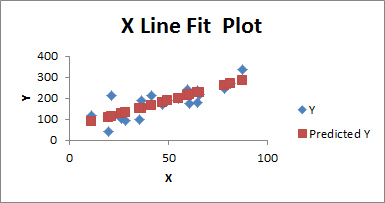
This one is pretty self explanatory. The red squares represent the predicted y-value for each given x-value based on the regression equation, and the blue diamonds represent the actual y-value for each x-value. Looking at this graph will give you a sense for whether anything is awry, and it will give you a useful visual presentation of the equation, and the data it’s using.
That wraps this section up. Of course, in the real world, a lot of times we’ll be working with nonlinear processes, and we’ll also run into y-values with several different predictors. Let’s talk about how to do that.
How to Do Multiple Regression Analysis in Excel
Suppose we had several possible predictor variables, instead of just one, like this:
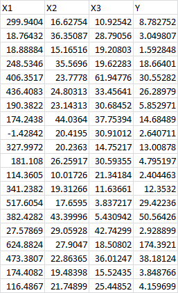
Our initial approach isn’t all that different. We start by clicking on the Data tab, heading over to the Analysis section, and clicking Data Analysis. (If you skipped over it, you can learn how to enable this at the beginning of this post.)

As before, we select Regression from the pop up and hit OK:

If you highlight the column labels, make sure to check the Labels check box. I suggest checking the Residual Plots and Line Fit Plots so that you can look for any inconsistencies. Now populate the Input Y Range box by selecting the Y column from your spreadsheet, as before:
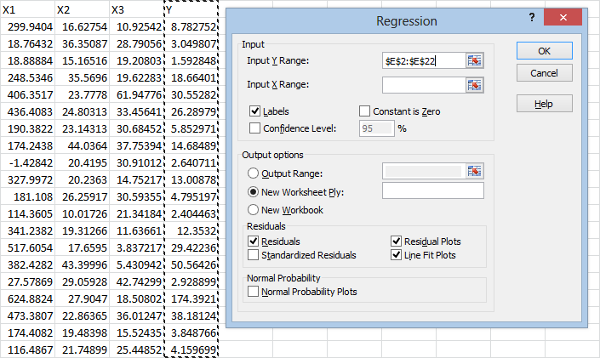
For the Input X Range box, select all of your predictive variables, like this:
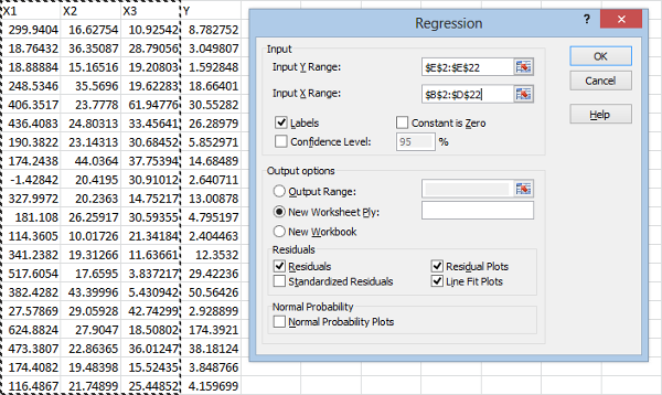
Now hit OK:
From the ANOVA, it is clear that at least some of the variables are having a statistically significant effect on the y-values, since the Significance F (the p-value for the F-test) is well below our cutoff of 0.05:

(As a reminder of what this means: there is only an 0.0058 chance that we would calculate a sample ratio of explained variance this high if the true explained variance were zero.)
Even so, our Regression Statistics aren’t especially encouraging:
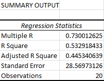
The Multiple R measures the linear correlation between our predicted y-values and the actual y-values. When it comes to multiple regression, I usually ignore the R Square value and just look at the Adjusted R Square, since it measures the explained variance while ignoring the influence of the extra variables. (Anytime you add a new variable, it will increase your R Square, even if that variable has no real influence on the y-values.)
In this case, the Adjusted R Square tells us that the model explains 44.5 percent of the variability in our data. While our Significance F tells us this almost certainly means something, it also suggests that we can’t use our equation to make predictions that are practically useful in most circumstances. (This all depends on what you’re working with, of course. This would be considered pretty high in the social sciences.)
Remember that the Standard Error is actually just the sample standard deviation, not the standard error of the mean. It’s based off of the sample y-values, ignoring the x-values.
To get a more specific idea of the predictive usefulness of our equation, we can look at the statistics for each variable:

From the p-values, we see that the only statistically significant contributions come from the X1 variable.
At this point, our first thought might be to try running a regression with just the X1 variable, and compare the Adjusted R Square values. Before doing this, though, it’s worth taking a look at the residuals. Since X1 is the most significant variable, it’s probably best to start by looking at the residuals for it:
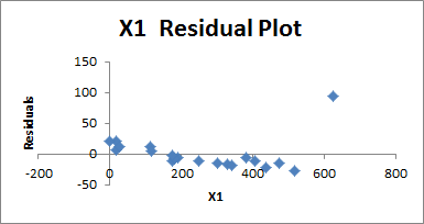
It should be immediately obvious that the residuals don’t appear evenly scattered. They start off above the predicted y-value, then drop below it. The final point also looks very extreme, and rises back above the predicted value. This looks a bit like curvature, suggesting that we might want to consider higher order variables.
The extreme y-value at the end also suggests another possibility: we might be dealing with a multiplicative model. In other words, we might want to consider replacing Y with ln(Y). This is a possibility we should always consider if the residuals get more extreme as the predictive variables get larger.
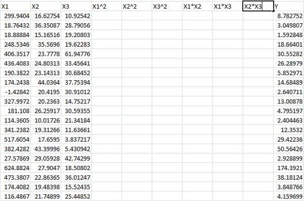
At this point, the best course of action is to build a higher order model. To be thorough, we should include X12, X22, X32, X1*X2, X1*X3, and X2*X3. We could also include X1*X2*X3 if we wanted to be especially thorough, as well as add higher order terms, but we will keep things second order. This is usually sufficient for run of the mill optimization problems.
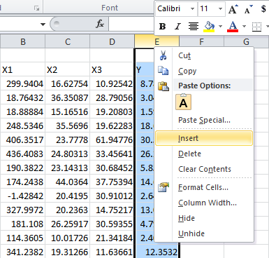
We’ll start by adding columns for each, one by one, by right clicking the top of the column and clicking Insert:
Then we label them:
And enter in the formulas:
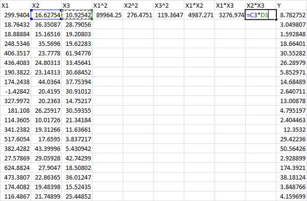
Select them:

And drag them down by the square black block at the bottom right of the selection:
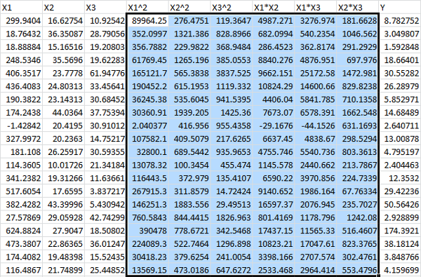
Finally, we’d like to compare a regression for Y with a regression for ln(Y), so we add one more column:
![]()
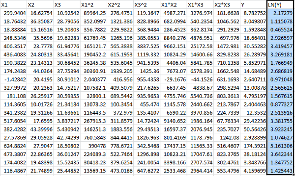
At this point, we will run two separate regressions, one using Y as the dependent variable, and one using LN(Y) as the dependent variable. We’ll be using the same method discussed above, so we’ll just skip ahead to the conclusions.
First, we compare the Adjusted R Square for each model.
Using Y:
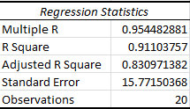
And using LN(Y):
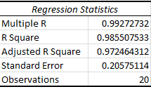
It’s immediately clear that the Adjusted R Square value for the logarithmic model is much higher, suggesting that it’s the appropriate model to use.
As a rule of thumb, this is often true. Just keep in mind that, in reality, you’re comparing apples to oranges, since your dependent variables, Y and LN(Y), are different. Using this kind of comparison will get you laughed out of academic circles, but it’s typically fine for engineering and other non-academic problems.
Typically, the easiest way to more formally decide between the two models would be to test the residuals for Normality, and choose the model with the most Gaussian residuals. Again, unfortunately, Excel doesn’t provide us with any easy tests for Normality, and we have to build our own. As I said before, this PDF (not mine) can tell you how to build a chi-square goodness of fit test.
Supposing we choose to work with the logarithmic model, it’s rarely a good idea to keep all of the higher order variables introduced above. We need a method for eliminating unnecessary variables. Unfortunately, we can’t do this just by looking at the p-values since, surprisingly none of them reach significance:
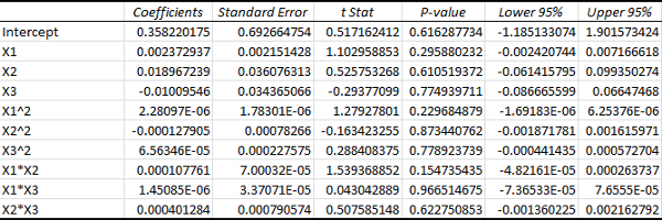
Still, as we can see from the ANOVA, the p-value for the overall model is actually very small, even though the p-values for the individual variables are large:

Our Significance F, which is the p-value for the F-test of explained variance, is minuscule. This means that the probability of our estimated explained variance being at least this high, if the real explained variance were zero, would be on the order of 10-8.
Now we can start picking off variables one by one, starting with the highest p-value. In this case, we eliminate X1*X3 from the model, and see how it influences our results. (A word of warning: Excel won’t let you select two separate ranges for your x-values. You will need to delete the column you’re removing, so it’s a good idea to copy and paste your data somewhere else first.)
After doing this, we can see that our Adjusted R Square increases:
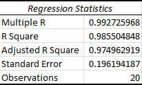
We can continue doing this until our Adjusted R Square goes back down to find the optimal model. Remember that the p-values will change every time you run a new model. Also keep in mind that if you eliminate a lower order variable, you need to eliminate all of it’s higher order counterparts. For example, if we removed X1, we would need to remove X12, X1*X2, and X1*X3. So even if the p-values are worse for the lower order variables, it’s always better to start with the higher order variables. By this I mean that you should compare the highest order term for each variable.
In this case, after picking off a total of 3 variables, we reach our highest Adjusted R Square value. After picking off one more variable, the adjusted R Square goes back down. Look how the p-values have changed for the optimal model:

Notice how the X1, X2, and X1*X2 variables have all reached significance. Our next target would be X3, but as I said, removing this variable decreases the adjusted R squared. The goal isn’t to remove all of the insignificant variables, it’s simply to find the equation that explains the most variation in the data. That is the model with the highest Adjusted R Square.
It’s important to realize that this method isn’t perfect. I know for a fact that X3 plays no part in the “true” equation, because this is simulated data, and X3 wasn’t used to generate our y-values. (A more rigorous approach would use a statistical test for nested models, but that’s a story for another day.)
It might also be tempting to try and minimize the Significance F instead of the Adjusted R Square, but this method tends to be highly unforgiving. It will often lead you to eliminate variables that actually do influence your dependent variable.
And that should cover most of what you need to know about multiple regression in Excel.
Click here to learn how to perform statistical tests in Excel in Part 2.
Thanks for reading. For more updates like this one, be sure to subscribe below.