Today I’m going to finish up this series on data analysis in Excel. This time around, I’ll cover all the basic statistics like correlation, covariance, descriptive statistics, and so on. We’ll also talk about a few miscellaneous tools for exponential smoothing, Fourier analysis, moving averages, random number generation, rank and percentile, and sampling.
You’ll need to enable the Analysis ToolPak if you haven’t already. Click here to take a look at Part 1 to find out how. If you were trying to figure out how to do real regression analysis in Excel, you will also find that in Part 1.
For statistical tests like the ANOVA, t-tests, and the F-test, click here to take a look at Part 2.
I’ll just go ahead and dive right in.
Correlation Analysis in Excel
You probably already know it’s actually pretty easy to find the correlation between two variables using the CORREL and PEARSON functions in Excel, but this isn’t quite so convenient when you start dealing with more than two variables. Let’s say you wanted to know how 4 variables were correlated with each other, like this:
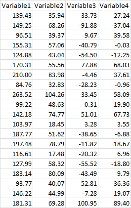
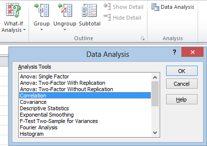
This can get tedious fast if you do it by hand, but the Analysis Toolpak makes it pretty easy. As usual, click the Data tab, go to the Analysis section, and click Data Analysis. Now click Correlation and hit OK:
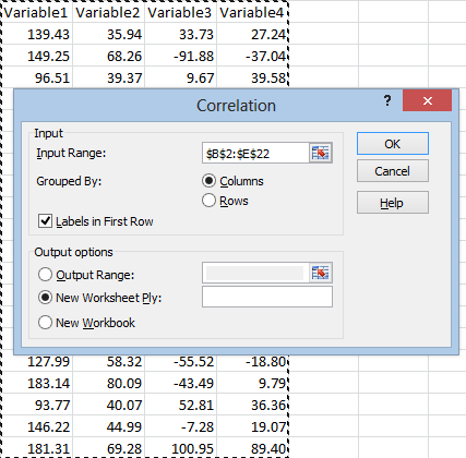
When the Correlation window pops up, click in the Input Range and select your data. Check the Labels in First Row box if you selected your headings, and then hit OK:
Your output should look something like this:

This table lists the correlation of every variable with every other variable, where row meets column. Here we can see that Variable1 and Variable2 have a pretty strong correlation of 0.83, and that Variable3 and Variable4 have an even stronger correlation of 0.94. The other correlations are weak or nonexistent, with the weakest being between Variable3 and Variable2.
Never base conclusions on correlation alone. Correlation is a guideline that can point you to relationships that might be interesting. Unfortunately, Excel does not list the p-values for these correlations. This frustrates the hell out of me, because you need the p-value in order to determine whether any of these results are statistically significant. It’s tempting to get the p-values using regression analysis, but this isn’t actually the right approach either. You need to run a simultaneous test such as Tukey’s test, which Excel offers no native solutions for.
Also, there’s the oh-so-familiar mantra: correlation does not equal causation. We’ve all heard it, but it’s important to remember. Unless your data is coming from a controlled experiment, this is about relationships, not about cause and effect.
How to Calculate Covariance in Excel
In addition to correlation, the Analysis Toolpak has a function for covariance:
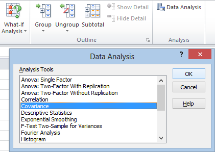
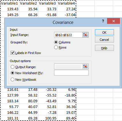
After clicking Data Analysis in the Analysis section under the Data tab, just select Covariance and then hit OK. Once the window opens, be sure to check the Labels in First Row box if your data is labeled. Click in the Input Range box and select your data. You might need to switch it from Columns to Rows if your data is organized differently than mine. Now hit OK:
The output looks like this:

You’ll definitely want to label this, since at first glance it looks very similar to the correlation matrix.
Descriptive Statistics
If you’re just looking for basic, run of the mill summary statistics, Excel has a convenient tool for that. It’s labeled “Descriptive Statistics” in the Analysis ToolPak:
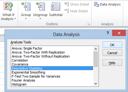
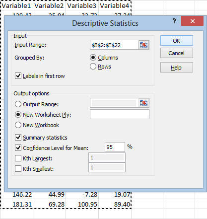
As always, click in the Input Range box and select your data, making sure to select Labels in first row. You are free to work with multiple variables. At the bottom of the window you will almost certainly want to check Summary statistics, which lists all of the standard information. You may also want to select Confidence Level for Mean. You need to check this box in order to get the confidence interval. It’s not just there to change the confidence level.
You don’t need to use the Kth Largest or Kth Smallest statistics unless you want to know the value of a particular order statistic. If you selected Summary statistics, you will already get the maximum and minimum values.
After you hit OK and format the columns, your output will look something like this:

Zooming in on one variable:
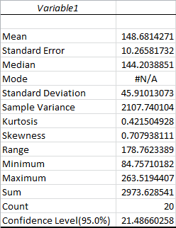
Most of this should be pretty self explanatory. The Standard Error is the standard deviation of the mean, while the Standard Deviation is for the sample points themselves. The Sample Variance is the square of the standard deviation, the average squared distance of your sample points from the mean. The Mode will always be #N/A unless an exact value occurs more than once in your sample data, in which case it’s the most common value. As a reminder, the Mean is the traditional average, and the Median is the value that separates your sample points in half. The Minimum and Maximum are exactly what they sound like, and the Sum is the total of all sample points. The Count is the number of sample points.
Kurtosis measures how peaked the distribution is. The Kurtosis of the Normal distribution is 0. Higher Kurtosis means that your sample points tend to be closer to the mean and farther off in the tails than usual. (This is technically excess Kurtosis.)
Skewness measures how far off symmetry the distribution is. A skewness of 0 means your distribution is symmetric. Positive skewness means you have more extreme positive deviations than extreme negative deviations.
The Confidence Level is half the range of your confidence interval. In this case, the confidence interval would be 148.68 ± 21.49. Since we chose a confidence level of 95%, this means there is only a 5 percent chance that our confidence interval doesn’t contain the true mean.
Moving Averages and Exponential Smoothing
Excel has two tools that are useful for analyzing trends in time series data: moving averages and exponential smoothing tools. These are standard tools used by financial experts, stock traders, and so on. Unlike much of what we’ve been talking about, these smoothing tools don’t give you any kind of statistical insight into what’s happening, and you can’t use them to make predictions.
Moving averages and exponential smoothing are considered “lagging indicators.” This means that they don’t show a trend until after it starts.
Nevertheless, they can be useful because they strip out random fluctuations.
Let’s say you were working with time series data that looked like this:

The moving average tool in Excel simply calculates the average value over the past few occurrences, in this case, the number of visits to my site over the past few days. Technically, this is considered a simple moving average. The simple moving average is generally considered to be better at detecting trends than exponential smoothing, but it also tends to lag behind the data more.
To get started, from the Data Analysis menu, select Moving Average and then hit OK:
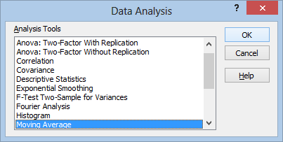
The moving average menu looks like this:
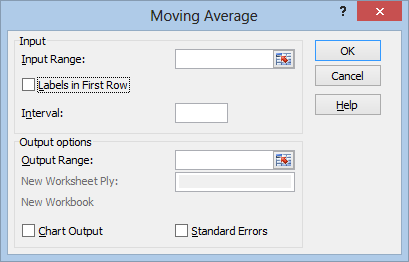
Select your Input Range as usual, making sure to include the title row if you select Labels in First Row. Unfortunately, Excel can’t interpret the column I have on the left, containing the Date information. The output will just be indexed from 1 to 20, without any labeling.
The Interval is the number of data points to average over. This is entirely subjective. In this case, I’ll be averaging over the most recent 3 days.
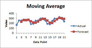
Check Chart Output to get a graph of your moving average superimposed on top of the real data. Since this chart won’t contain any labeling for the date, it might be a better option to skip it and set up your own chart later.
Check Standard Errors to get the standard error for each moving average you calculate. The larger your standard error, the more volatile the trendline. Don’t mistake this for a standard error that you can use for prediction. Moving averages and exponential smoothing can’t be used for prediction in any rigorous sense:
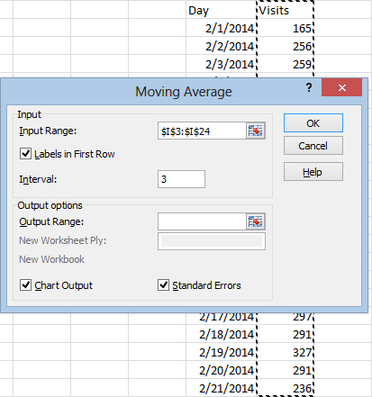
For whatever reason, Excel doesn’t give you the option of pasting these in a new worksheet or workbook, so you will need to select where to paste the results using the Output Range box:
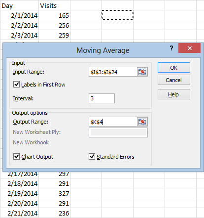
And hit OK. The results will look something like this:

Excel will list #N/A for the days where a value couldn’t be calculated yet (since there weren’t enough days to work with). The column on the left lists the moving averages. The column on the right is for the standard errors, if you chose to include them.
The chart will look something like this:
The process for exponential smoothing is similar. After selecting Exponential Smoothing from the Data Analysis menu, and hitting OK, you will get this menu:
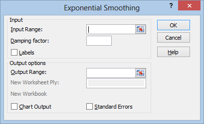
Everything here should be familiar except for the Damping factor. This is the portion of your data that you want to count as “error.” If you’ve learned about exponential smoothing before, you’ve probably heard of the smoothing constant, alpha. The damping factor is 1 minus alpha.
Suggested damping factors are between 0.20 and 0.30, although again, it’s all pretty subjective.
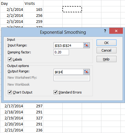
After making your selections and choosing your output range, just hit OK and you’ll get results like this:

The most notable difference between exponential smoothing and moving averages is the fact that exponential smoothing uses all of your data to compute each prediction. The most recent observation has the strongest impact on the value, and each previous data point has exponentially less influence. This is why there’s only one #N/A value here.
Fourier Analysis
Fourier analysis is a useful tool that we can use to transform data from a time scale to a frequency scale. If we recorded a series of impulses over time, we could use Fourier analysis to find the distribution of amplitudes for the frequencies associated with those impulses.
Excel uses a discrete Fourier transform. If you want to know more of the specifics, take a look at the Wikipedia article.
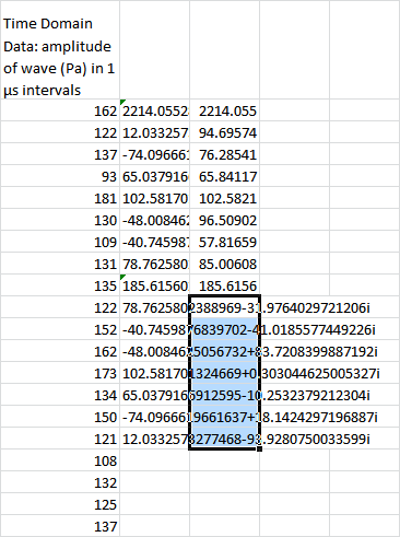
So, suppose we had the raw data of a sound wave’s amplitude, taken in microsecond intervals, like this:

To find the frequency distribution, we can use Excel’s Fourier analysis tool. From the Data tab, we head over to the Analysis section, and hit Data Analysis. Then we select Fourier Analysis and hit OK.
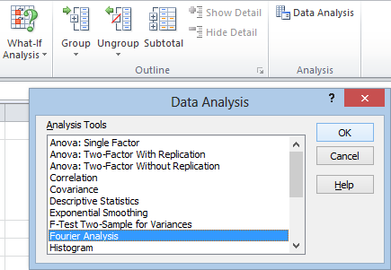
As usual, we use the Input Range to enter our data. Unfortunately, Excel’s discrete Fourier tool can only deal with input in powers of 2. We can’t select all 20 rows. We can only select 16 of them:
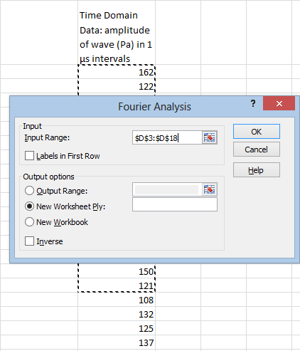
The Labels in First Row box is pointless. Excel doesn’t use the column labels for anything, so it’s better to just not select them in the first place. It’s convenient to use the Output Range option in order to paste our frequency distribution right next to the the waveform data:
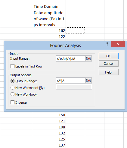
Next we hit OK, and get this:
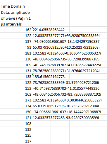
So, what does all this mean, and what’s up with the imaginary numbers?
Well, the imaginary numbers are just a convenient way of expressing phase. For each frequency, it reports the amplitude of the cosine wave and the amplitude of the sine wave. The cosine wave is represented by the real part, and the sine wave is represented by the imaginary part. There’s a mathematical reason why it can be expressed this way, but we won’t get into that.
In most cases, you’re not going to need this phase information. If all you care about is the magnitude, you can easily transform this into real numbers using Excel’s IMABS function:
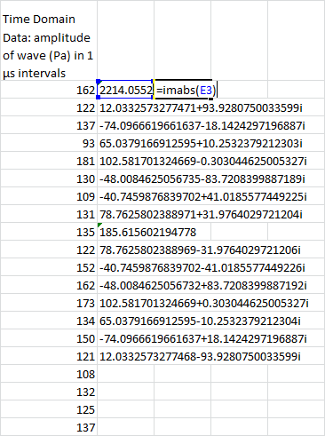
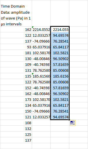
Alright, let’s talk units. The amplitude scale hasn’t changed. It’s still going to be measured in Pa.
The intervals are no longer in the time domain, however. They’re in the frequency domain. The sampling frequency is 1/(1 μs) = 106 Hz. This is chopped up in 16 sections, so each frequency interval is 62,500 Hz across.
(Obviously, this data is outlandish. I’ve done this in part to make a point. There’s an uncertainty principle between time and frequency data. The smaller your time intervals, the larger your frequency intervals.)
Now, here’s something else you might notice. The amplitudes are mirrored around the value of 185.6 Pa. There are formal mathematical reasons for this, but for our purposes I’m just going to say you really don’t need it. You can just delete it, like so:
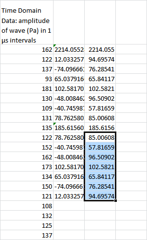
And for visibility reasons, you’re probably going to want to adjust the column with the imaginary numbers:
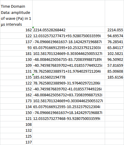
If you’re still not quite sure what you’re looking at, I can’t blame you. This isn’t the most self-explanatory of the Tookpak’s macros. Not by a long shot. However, a bit of labeling should help things along:
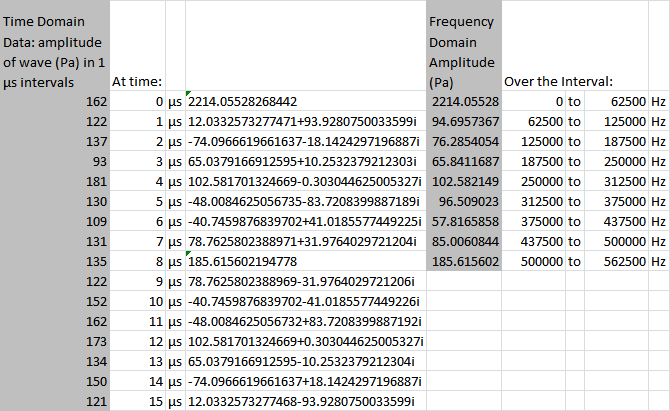
And, in all honesty, we’ll probably just want to white out and hide that center column:
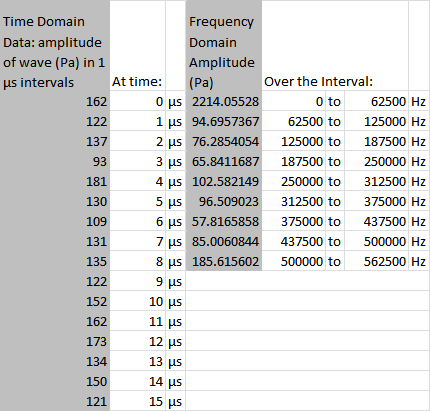
Excel’s Analysis Toolpak also allows you to run this process in reverse, from the frequency domain to the time domain. The process is basically the same, so I’m not going to go through it here.
Random Number Generation
In addition to all its various statistical tests, Excel’s data analysis toolpak includes a feature that allows you to simulate data off of a number of distributions, including:
- Uniform
- Normal
- Bernoulli
- Binomial
- Poisson
- Patterned (where you specify a pattern)
- Discrete (where you sample off of a collection of existing data)
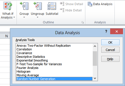
To get to the random number generator, as usual, head to the Data tab, over to the Analysis section, and hit Data Analysis. Then you’ll just select Random Number Generation from the popup menu and hit OK:
So, let’s go over this window piece by piece:
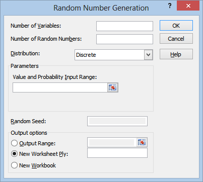
Number of Variables is really just “number of columns” in my opinion. Since the results are all coming from the same distribution, it’s a little misleading to call them “variables.”
Number of Random Numbers, similarly, is really just “number of rows.”
If you like, you can also leave these first two fields blank, and just use the Output Range field in the Output options section. The range that you select will completely fill with random numbers by default.
The Distribution field is where you can select which probability distribution you want the numbers to come from:
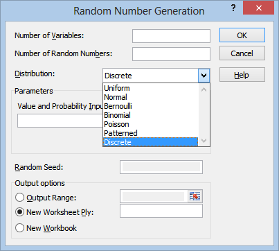
The Parameters section will change depending on which distribution you select. For example, if you select the Uniform distribution, the field will change to look like this:
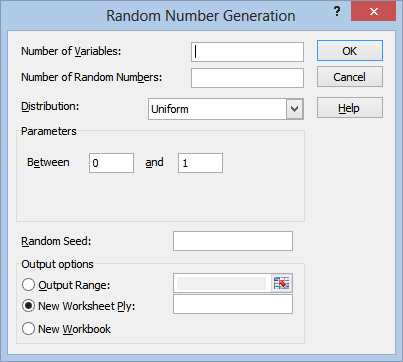
So that you can select the limits of the distribution. I won’t go over all of these parameters in detail, since you need to understand the underlying distributions in order to make use of these anyway.
The Random Seed field is optional. You can enter any number you like in here in order to generate a random sequence of numbers. The main reason for doing this would be if you wanted to generate the exact same sequence of “random” numbers more than once.
Once you’ve filled out all your fields, all you need to do is hit OK. The output should be self explanatory: it’s just a sequence of random numbers from the distribution you selected, organized in the number of columns and rows you specified.
Rank and Percentile
The rank and percentile tool organizes your points from largest to smallest, and assigns a percentile to them: pretty much exactly what you would expect it to do. The only real surprise here is that it can also handle multiple variables.
So let’s say we had a series of 20 samples from 3 variables, like so:
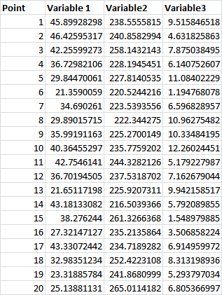
As usual, we head over to the Data tab, the Analysis section, and click on Data Analysis, then we select Rank and Percentile and hit OK:
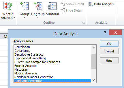
That takes us to this window:
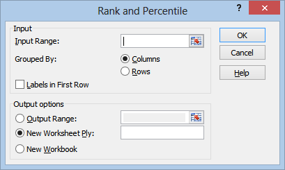
The rest is pretty straightforward. We click inside the Input Range field, and select our data:
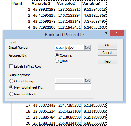
(The “Point” column here is just for our own reference, it’s not a variable of it’s own. You’ll see why it’s nice to have once we have our output.)
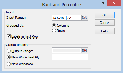
As usual, if the labels are in the top row, you’ll want to check the Labels in First Row box:
After selecting your output option, just hit OK, and you’ll get something that looks like this:
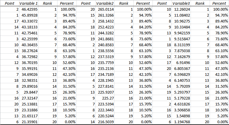
Now you can see why we included the “Point” column with our original data. This helps us identify which value refers to which point. The output automatically generates these columns. The word “Point” wasn’t taken from our original data.
For each variable, you get a Rank column, with Rank 1 corresponding to the highest value.
You also get a Percent column, obviously with 100 percent corresponding to the largest value, 0 percent corresponding to the smallest, and 50 percent, if it exists, corresponding to the median.
Sampling
As far as I can tell, Excel’s sampling tool is no different from using the discrete distribution in the random number generator. You can use this tool to generate a random set of numbers taken from an existing set of data. (It also offers the more or less useless option of grabbing patterned data from a sample.)
There is no option to sample without replacement. The tool always samples with replacement.
This tool is pretty self-explanatory:
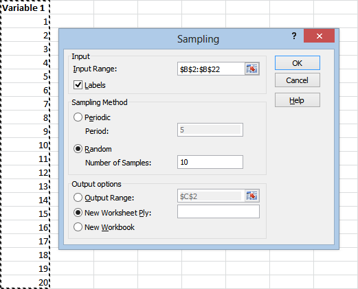
Just use the Input Range field to select the data you want to sample from, and be sure to check the Labels box if your label is in the top row you selected. (You might as well just not select it, it doesn’t show up in the output.)
Under Sampling Method you’ll probably want to use the Random option. Use the Number of Samples field to specify how many numbers you want generated.
(If you choose the Periodic option, Excel will select every nth point from your initial sample. In this case, for example, if we chose 5, Excel would return the results 5, 10, 15, and 20.)
Once you select your output option, just hit OK, and you’ll get a list of numbers randomly taken from your original distribution.
That’s a Wrap
Alright, that covers just about everything there is to know about Excel’s Data Analysis tool, enabled through the Analysis Toolpak. If you missed the first two installments, here they are:
Part 2 covers statistical testing including the ANOVA, t-tests, and F-tests.
Thanks for reading. Be sure to subscribe below if you want to see more updates like this one.
