Sometimes, the vast majority of our problems have just a few small causes.
Pareto charts, and Pareto analysis, are tools that help us discover which problems are causing most of our defects (or alternatively, which small number of opportunities offer the majority of the payoff).
Today, I’ll talk about how to build a Pareto Chart and run analysis on it, as well as address some common questions about it, including a few pitfalls you’ll want to avoid.
As usual, I’ve also put together a spreadsheet that you can use to skip all the busy work. The spreadsheet does all the sorting, calculates your cumulative percentages, and builds the chart for you, as well as identifying your “vital few” and “trivial many,” and helps you identify whether they actually “obey” the 80-20 rule. You’ll need Excel 2007 or higher for this one.
You can get that spreadsheet, and sign up for more practical updates like this one, using the form below. (I will never share your email address with anybody.)
How to Build a Pareto Chart in Excel, An Example
Don’t want to download my spreadsheet? I won’t lose any tears over it, but you’ll need to build your own.
Here’s how.
You’ll start by entering the category of defect in your first column, like so:
(Keep in mind we aren’t necessarily talking about defects here. This same approach can be applied in a much wider variety of circumstances, and it doesn’t have to be focused on “eliminating the bad.”)
In the next column over, enter the number of defects in each category. (Actually, if you really want to get management on board, you’ll want to get these figures in dollars if at all possible. Yeah, that means talking to the accountants, or at least making estimates based on real data somewhere.)
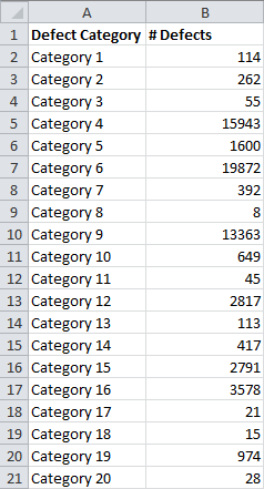
Now, rather than having just the number of defects (or cost of defects), we’d like to see this as a percentage. This tells us what percent of our defects belong to each category. You can do this using a formula like this:
=B2/SUM($B$2:$B$21)
I enter this formula in C2. Let me break this down. To find the percentage for each category, we need to find:
Number of Defects in Category / Total Number of Defects
This formula pulls the number of defects in Category 1 from cell B2. It finds the total number of defects using the SUM() formula. I sum over the range $B$2:$B$21 because this contains all of the defects. I use the $ symbols to assure that this range doesn’t change when I replicate this formula in a different cell.
(Without the $ symbols, if I dragged this formula down to cell C3, it would sum over the range B3:B22, which doesn’t contain all of the defects.)
I get this as a result:
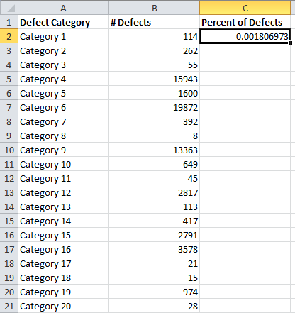
Now I grab the black box at the bottom right of the cell, and drag it down to the final category:
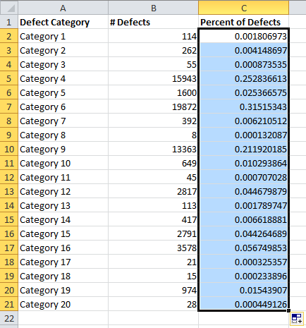
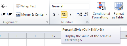
We’d rather see this as a percentage than in decimal notation, so we head up to the menu, making sure the Home tab is selected, and push the % button in the Number section:
So that the results look like this:
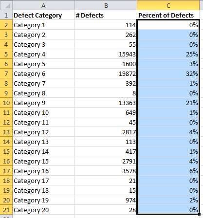
You’d probably rather not see those small figures listed as 0%, so we need to head back up to the Numbers section and click the Increase Decimal button (in my case twice):

So that the results look like this:
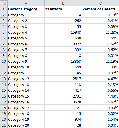
Before we go any further, we need to sort our table, so that the categories with the most defects are listed up top.
To do this, we start by clicking anywhere in our table of data:
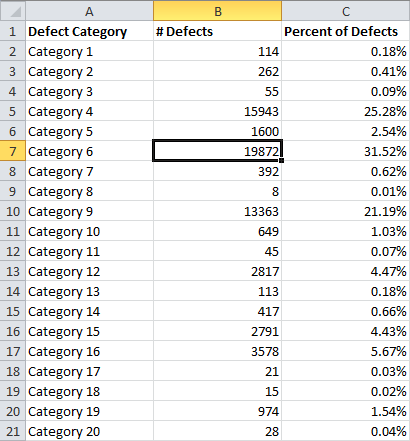
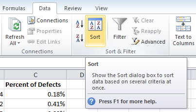
Next, we head over to the Data tab:
![]()
And click the Sort button:
Which brings up this box:
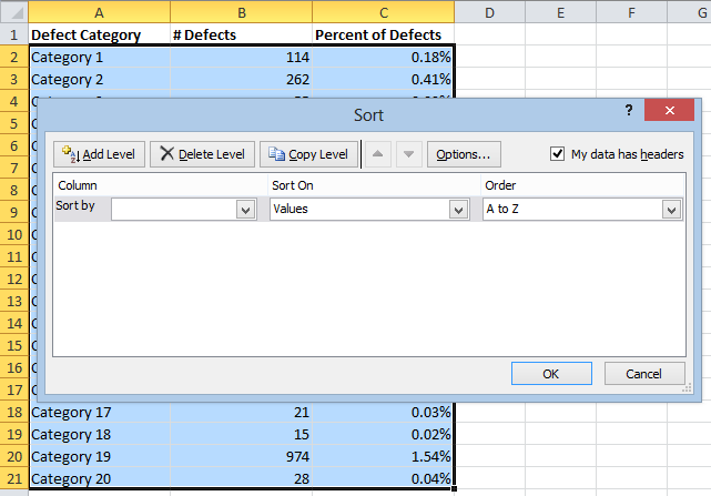
We need to change the Column menu so that it sorts by the number of defects (or the percentage, either is fine), and we need to change the Order so that it’s from Largest to Smallest, like so:
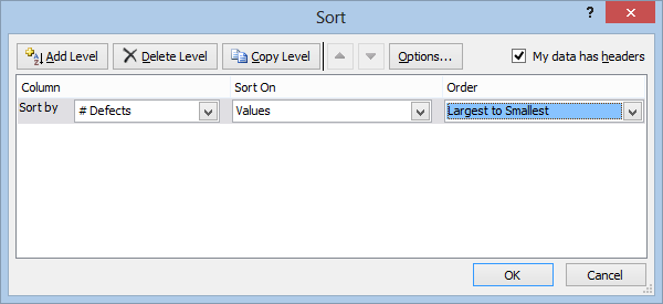
After hitting OK, here’s what I get:
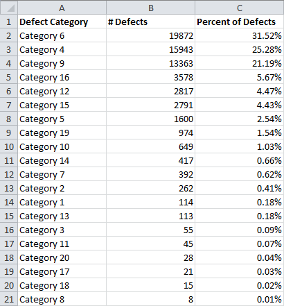
Now, one of the most useful things about Pareto charts and Pareto analysis is the fact that it tells you the cumulative percentage. This tells you what percentage the total number of categories up to that point use up. So, the first cell tells us the percentage of defects in the first category. The second cell tells us the percentage of defects in the first and second categories, and so on.
This allows us to identify how many kinds of defects we would need to resolve in order to eliminate 80 percent (or any other figure, really) of the defects.
To find the cumulative percentage, I start by just copying over the first percentage from cell C2 to cell D2. I do this by entering this simple formula into cell D2:
=C2
And I get this:
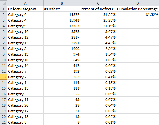
Now, I want cell D3 to be the sum of the percent of defects in the top two categories, so I use this formula:
=C3+D2
This adds the new percentage to the previous cumulative percentage:
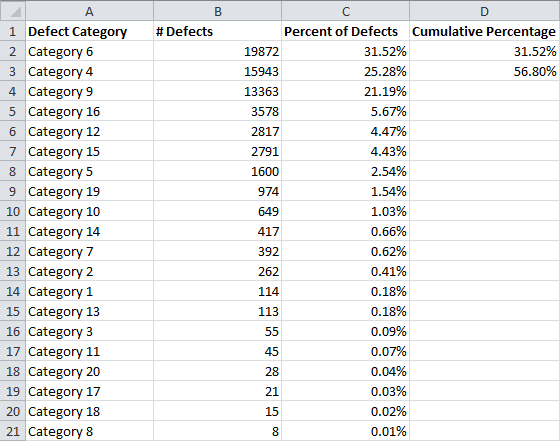
Now we just need to drag this formula down the column by selecting cell D3, grabbing the black box in the bottom right corner of the cell, and dragging it down to the bottom of the table:
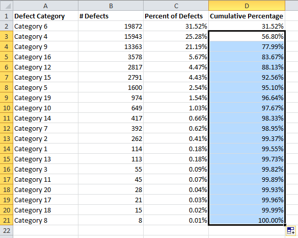
If you did it right, the bottom cell should say 100%.
Now we need to see this as a chart.
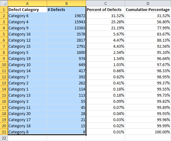
To do that, we start by selecting the Category and # Defects columns:
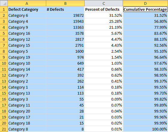
We also want the graph to include the Cumulative Percentage column. In order to select this without selecting the Percent of Defects column, we need to hold the ctrl key on the keyboard, then select the new column:
Now we click over to the Insert tab, push the Column button, and choose the Clustered Column option:
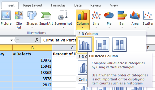
A chart like this appears:
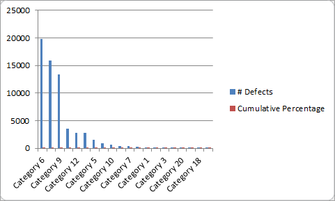
The Cumulative Percentage data is currently useless in the chart. For it to be useful, we need a second axis. We also need to format it as a series plot. To do this, we need to click on Cumulative Percentage twice (but without double-clicking). Next, we right-click on it, and choose Change Series Chart Type:
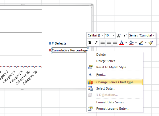
On the next menu, we choose Line on the left, and make sure Line With Markers is selected:

After hitting OK, our chart looks like this:
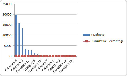
This still isn’t useful to anybody, so we need to add a new axis on the right side that runs from 0 to 100 percent. To do that, we right click on our new Cumulative Percentage line, and choose Format Data Series:
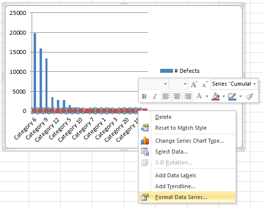
That takes us to this window:

I click Secondary Axis and hit Close. Now my chart looks like this:
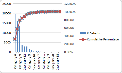
This is way more helpful, but it’s a little awkward because the axis on the right goes up to 120%. We can fix this by right clicking on the axis and hitting Format Axis:
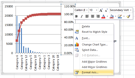
Then I switch the Maximum from Auto to Fixed and change it from 1.2 to 1.0:
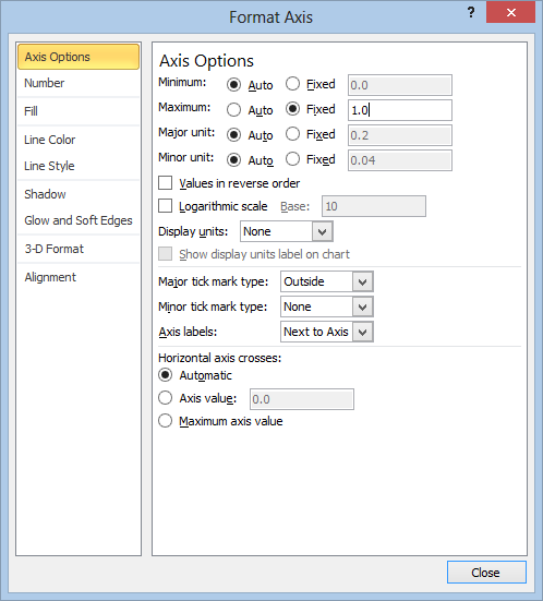
After I hit close, the Pareto Chart looks like this:
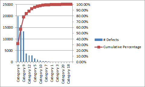
So, we finally have our Pareto Chart, a nice pretty graph you can show to execs so that they can understand what you’re trying to say.
Of course, this graph alone isn’t going to do you much good without a bit of analysis. So…here we go again:
How to Run Pareto Analysis in Excel
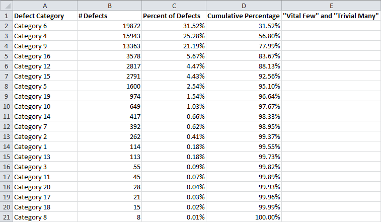
If you’ve gone this far, Pareto analysis as it’s usually defined is a pretty easy process. All you need to do is work your way down the Cumulative Percentage column until you hit 80+ percent. This rule of thumb allows you to separate your most important types of defects from your least important.
The small number of defect categories with the most impact are generally referred to as the “vital few,” while the remaining categories are usually called the “trivial many” or “useful many.” The phrase “trivial many” can be a bit misleading, and I have other issues with Pareto analysis that I’ll get into later, but for now I’m just going to tell you how to label these quickly in Excel.
So, I start by adding a new header in column E called “‘Vital Few’ and ‘Trivial Many’” like so:
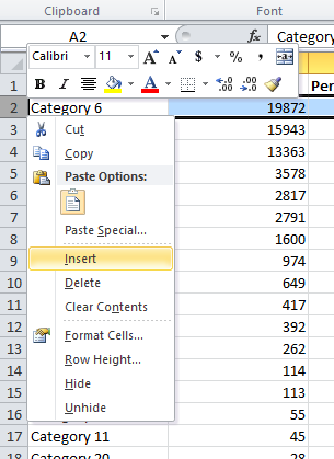
And I’m going to need to add a new row just below the headers. (You’ll see why in a second.) To do that, I right click on row 2 and select Insert:
Now, I select cell E3:
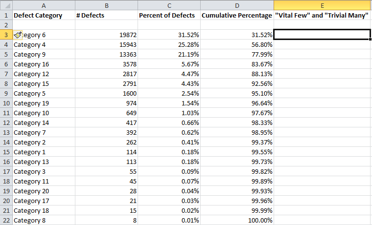
And I type this formula:
=IF(D2>0.8,”Trivial Many”,”Vital Few”)
This formula will output “Trivial Many” if the cell one cell to the left, and one cell up, is greater than 0.8, otherwise, it will output “Vital Few.” This is the reason for the empty row above. Here’s what the results look like after I copy the formula down the column:
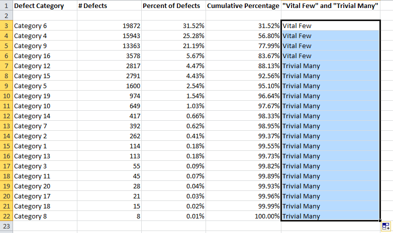
Note that this method counts Category 16, in the 6th row, as part of the “vital few.” This method assures that your vital few always includes 80+ percent of your defects.
Pareto analysis therefore suggests that we should focus most of our time and resources (perhaps 80 percent of them) trying to rectify defects that belong to categories 6, 4, 9, and 16, the “vital few.” While we shouldn’t completely ignore the rest of the categories, we shouldn’t devote a great deal of our time or resources towards them (perhaps less than 20 percent).
Now for a few questions, pitfalls, and things to think about when it comes to Pareto charts and analysis.
What’s the 80-20 Rule?
The 80-20 rule is a rule of thumb and it would be wise not to take it too seriously.
The basic premise is that you can expect about 20 percent of your types of defects to contribute to 80 percent of the total number of defects. In the example above, 4 categories of defect contributed to 84% of the total number of defects. Those 4 categories make up 20 percent of the total number of categories, 20.
This example is fictitious, so it shouldn’t be surprising that it obeys this rule.
The 80-20 rule was first suggested by a management consultant named Joseph M Juran. He called it the Pareto Principle, named after an Italian economist named Vilfredo Pareto. Pareto had observed, in 1906, that 80% of the land was owned by 20% of the population.
The Pareto principle doesn’t just apply to defects. For example, it’s a common rule of thumb that 80% of your sales will come from 20% of your customers, 80% of your productivity comes from 20% of your employees, etc.
The 80-20 rule emerges in relationships that obey a power law. In this kind of relationship, a linear change in one variable causes an exponential change in the other variable. But even among these kinds of relationships, the rule doesn’t need to be 80-20, although it’s fairly common. It just means that a small number of causes will contribute to a large percentage of outcomes.
By no means should you expect the relationship between your causes and your effects to obey a power law in every case.
If Things Don’t Always Obey a Power Law, What’s the Point of Pareto Analysis?
If you’re thinking that you can always identify some “vital few” number of causes that will resolve 80 percent of your problems, you might have sipped a bit too much of the Kool-Aid.
But…
The real work and the real opportunities in Pareto analysis don’t come from pushing the Sort button in Excel. The action happens long before you start building your chart using the method discussed above. (It would be nice if there were a spreadsheet I could build that would do it for you, but life doesn’t work that way.)
The trick to making Pareto analysis work lies not in assuming that the 80-20 rule is some immutable law of nature. Instead, it lies in finding the places where the 80-20 rule, and similar power laws, do hold.
When the power law doesn’t emerge naturally from your data, it’s not an indication that you did something wrong in the data collection, or that there’s some other way to interpret the data so that it does obey a power law.
Instead, it is an indication that you are asking the wrong questions.
When you start thinking about better questions to ask, you will find that there is usually some way to discover a hidden power law, allowing you to make the biggest differences with minimal resources.
The spreadsheet you can sign up for on this page automatically tells you the percentage of your “vital few.” You can use this to easily identify distributions where the “vital few” actually are few. The smaller this figure the better, although it technically only follows the 80-20 rule if it’s close to 20 percent.
For example, if you sort your defects by the type of defect, you might discover that your Pareto chart looks very flat, offering nothing useful. But if you instead try categorizing defects by product number, you may discover that the Pareto curve emerges.
Oh, and if you’re being asked to solve a very specific problem, and a power law doesn’t naturally emerge from it, I’m sorry. Sometimes things are just too complex, nonlinear, and scattered, and those “vital few” simply might not exist.
Don’t Confuse Treetop Analysis With Root Cause Analysis
If you use Pareto charting and analysis and identify a few small categories that are responsible for 80 percent of your defects, often what you’re left with is merely a description of the kind of problem you need to solve, not a root cause.
In order to dig deeper and find a root cause, you will typically need to run Pareto analysis again, on each category of interest, using different variables.
For example suppose that you ran Pareto analysis on part numbers and found that 50 percent of your defects were coming from a single part. To find the cause, you could run Pareto analysis on those parts by categories like location, machine, team, etc. This would allow you to dive down and find the likely cause of the issue, rather than simply identifying the situation.
On a similar note…
Categories Should Be As Granular And Well Defined As Practically Possible
However it is that you’re collecting your data, Pareto analysis is close to useless if there aren’t enough categories. There’s no hard and fast number here, but in general, the number of categories used in Pareto analysis should be as large as is practical. There are two main reasons for this:
- A power law doesn’t emerge when the number of categories is small
- It’s easy to combine categories, which can lead to very misleading results. The more granular your categories, the less likely this is to happen.
Similarly, if you have a category labelled “other” or something similar, and it rises toward the top of the Pareto chart, Pareto analysis isn’t going to do you any good.
Categories Must Be Mutually Exclusive and Collectively Exhaustive
Your categories need to be well-defined in a way that ensures all defects belong to exactly one category, no less, and no more. If defects end up getting listed in more than one category, you will end up making uninformed decisions based on nonsense data.
Pareto Analysis Should Be Performed On Relatively Large Data Sets
Pareto analysis doesn’t even pretend to seek out statistical significance. It’s important to understand that without confidence intervals, you don’t really know that one category will continue to contribute more defects than another just because that’s what has happened in the past.
If your processes are under statistical control, then you can use your tolerances to perform a statistically significant Pareto analysis. You can also use bootstrapping to give your categories “acceptance” intervals, a method recommended by Leland Wilkinson.
The important thing to realize is that Pareto analysis allows you to make decisions based on a best estimate of how things will be in the future, rather than a genuine statistical inference of the future.
For this reason, your data sets should be as large as is practically possible, to reduce the possibility of making decisions based on flukes.
Pareto Analysis Doesn’t Mean You Need to Start In The Fat Head And Work Your Way Down The Long Tail
If anybody tries to claim that anything about a Pareto chart requires you to focus all of your efforts on the “vital few” or the “fat head,” they are wrong.
If you define the “vital few” as the small number of issues that cause 80 percent of the problems (or cost 80 percent of the revenue), then you should devote 80 percent of your resources toward the “vital few,” and 20 percent to the “trivial many”, in an ideal situation.
The point is to dedicate your resources so that they maximize results.
The “Vital Few” Are Not Necessarily Easier Or Harder To Solve Than The “Trivial Many”
A related misconception that seems to float around the subject of Pareto analysis is the idea that the “vital few” are harder to solve simply because they have so much impact. This is not necessarily true, and in fact one of the major benefits of Pareto analysis is the fact that the “vital few” are sometimes very easy to solve, allowing you to cut out 80 percent of your waste in a very short period of time.
Sometimes the pendulum seems to swing the other way, where people believe that the “vital few” are always easier to solve than the “trivial many.” This is not necessarily true either. Often you have no choice but to focus on the “trivial many,” simply because the “vital few” are practically insurmountable.
Pareto analysis doesn’t tell you anything about how easy your problems are to solve, and in fact this is usually an impossible question to answer. Instead, Pareto analysis is most useful when it is used to tell you where you are wasting time and resources on issues that have very little impact, and where resources are most usefully dedicated.
Pareto Charts Can Mask Issues That Are Actually Very Important
Pareto analysis has essentially no grounding in statistical analysis, and it can’t be used for inference. It’s merely a description of the way things currently are. Problems are often correlated with one another, and what appears to be a major source of issues may actually be a side effect of something hiding in the “trivial many.” (Can you guess why I keep putting these phrases in quotes yet?)
Similarly, a small issue today can become a major issue tomorrow. On that note…
Pareto Analysis Is Best Run On Processes That Are Under Statistical Control
Since situations can change, Pareto analysis can be very misleading if it is run on data that is in dynamic flux. Old data in Pareto analysis can lead you to believe that a problem which has already been solved is one of your “vital few,” or mask a problem that has recently spiraled out of its control limits by labeling it as one of your “trivial many.”
When Used As A Blunt Instrument, Pareto Analysis Can Cause You To Cut Genuinely Vital Business Processes
Pareto analysis should be used as a method of prioritizing problems that need solving, or discovering opportunities. It should not be used as a way to cut programs.
A business is a complex adaptive system, and small changes can have dramatic consequences. While it would be crazy to claim that no program should ever be cut, or no segment of the workforce should ever be laid off, I can virtually guarantee that if you were to cut all of the programs in your business that you identified as part of your “trivial many,” you would lose much more than 20 percent of your revenue, and likely go out of business.
It’s Important to Run Pareto Analysis Before and After The Problem is Tackled
Identifying a single problem that’s responsible for a massive number of issues can seem like a victory on it’s own (and to some extent it is). But until your efforts actually change the shape of your Pareto chart, you haven’t made a measurable difference.
Ready to pick up that template? Use the form below to sign up for the spreadsheet, and for more practical updates in the future. This spreadsheet does the sorting and builds the chart for you, identifies your “vital few” and “trivial many,” and tells you whether your “vital few” actually make up 20% (or any other figure) of your categories.
(I will never share your email address.)
