Get a Pareto Chart & Analysis Template Right Here
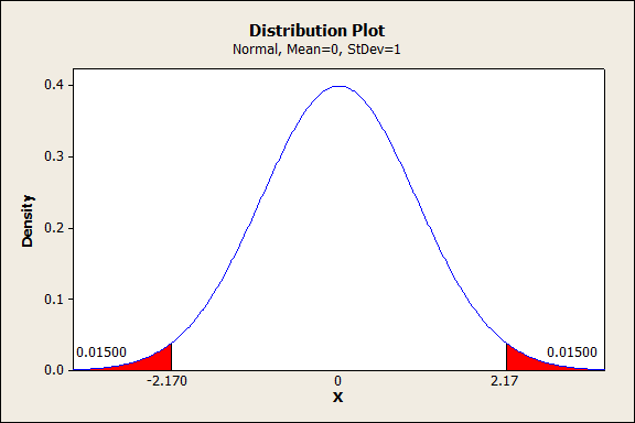
Sometimes, the vast majority of our problems have just a few small causes.
Pareto charts, and Pareto analysis, are tools that help us discover which problems are causing most of our defects (or alternatively, which small number of opportunities offer the majority of the payoff).
Today, I’ll talk about how to build a Pareto Chart and run analysis on it, as well as address some common questions about it, including a few pitfalls you’ll want to avoid.
As usual, I’ve also put together a spreadsheet that you can use to skip all the busy work. The spreadsheet does all the sorting, calculates your cumulative percentages, and builds the chart for you, as well as identifying your “vital few” and “trivial many,” and helps you identify whether they actually “obey” the 80-20 rule. You’ll need Excel 2007 or higher for this one.
You can get that spreadsheet, and sign up for more practical updates like this one, using the form below. (I will never share your email address with anybody.)


Statistical analysis in Excel is a huge pain unless you know how to enable the Analysis Toolpak. In part 1 of this series on data analysis in Excel, I’m going to tell you how to do that. Next, we’ll talk about regression analysis (the real thing, including multiple variables, not just fitting a line to a graph). This whole post should take 20 to 40 minutes.